


Day 7: Brand Imagery Toolkit
Crafting Connection Through Visuals
When it comes to the imagery around my books and author brand, I’ve chosen an approach that balances personal connection with touches of timeless elegance.
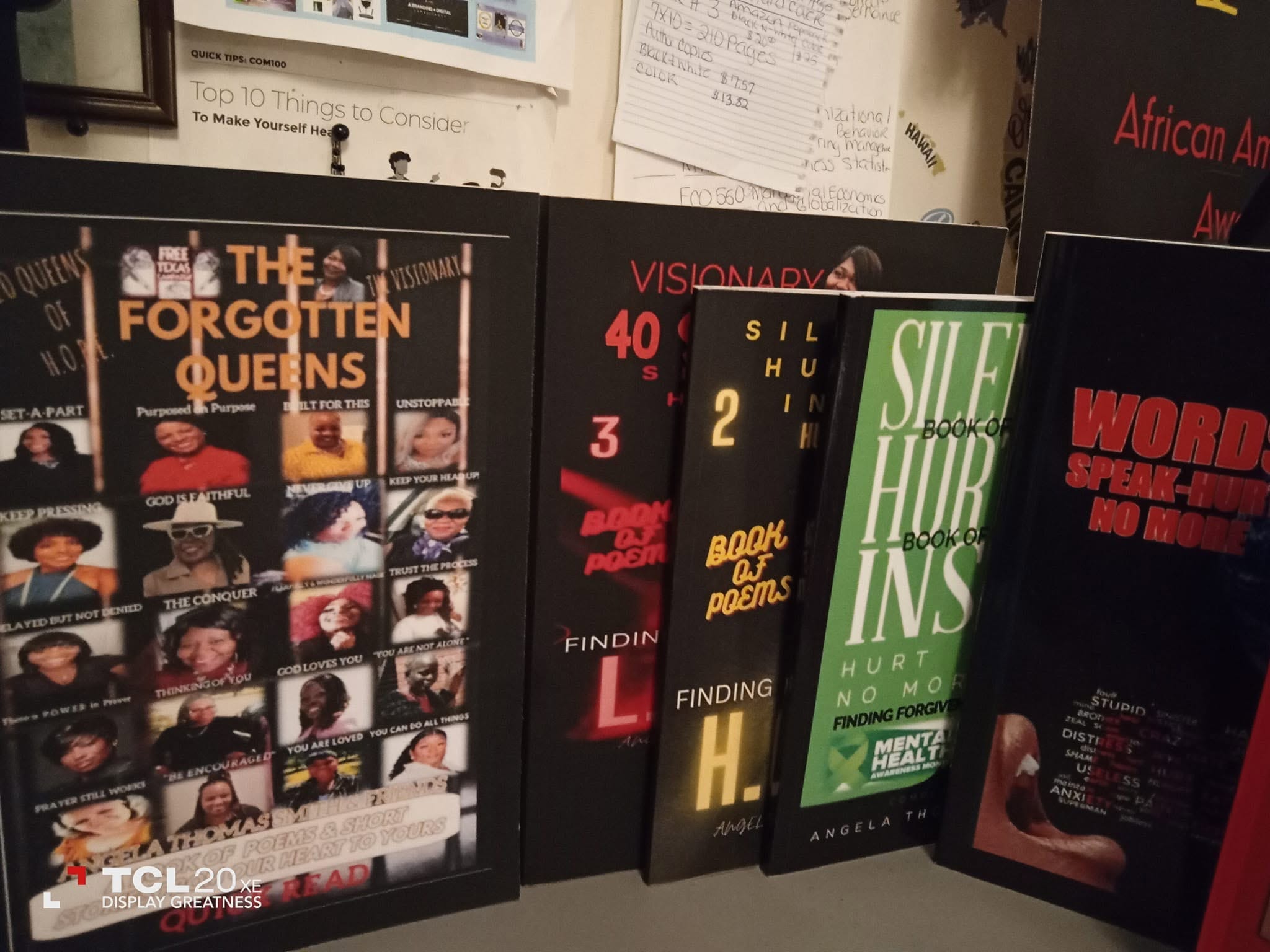
Book Covers
Each of my book covers is uniquely designed to reflect the story or message inside. Rather than sticking to a strict palette or repeated visual motif, I let the title and content guide the design. This keeps every book fresh and authentic to its own spirit.


Color Palette
If you look closely at my work overall, you’ll notice that I often gravitate towards two colors: deep purple and old gold. To me, these shades have always represented class and royalty—a subtle way to remind readers of the dignity and value in every story, no matter the subject.
Author Photos
For my author photos, I keep things real and relatable. You won’t find heavy filters or dramatic edits here. I want my readers and supporters to see the authentic person behind the words, because I believe true connection starts with honesty.

Logo & Website checkout MY BOOKS visit MY WEBSITE...
While I don’t use a highly stylized logo, the simplicity of my initials or my full name often appears, in keeping with the authentic vibe I strive for. My website, likewise, is driven by clarity and accessibility—inviting everyone in without pretense or complication.
The Meaning Behind My Choices
All these visual decisions flow from a single goal: authentic connection. Whether it’s the colors that hint at quiet regality or the photos that present the real me, I want my audience to know I see and respect them. My brand isn’t about perfection—it’s about being genuine and welcoming every reader just as they are.
Thank you for being a part of my journey and supporting my stories!
What elements do you look for in an author’s brand, or what makes you feel connected to the books you pick up? Let’s chat in the comments!


Share this post